45Line Plot Using R Graphics and R Commander/R Deducer
Line plots (or line graphs) are a staple in data visualization, particularly useful for displaying data trends and variations over time. They help data analysts understand how data points connect over a period or sequence, which is crucial for identifying patterns such as trends, cycles, and potential anomalies.
45.1 Utility of Line Plots in Data Analysis:
Trend Identification: Line plots are excellent for observing trends in data across time, such as sales data over the months or years, temperature changes through seasons, or stock market fluctuations.
Comparison: Analysts can plot multiple lines on the same graph to compare trends across different categories or groups, making it easier to evaluate relative performance or behaviors.
Temporal Changes: Line plots are inherently suited to data that changes continuously and is dependent on a sequential order, particularly time series data.
Smoothing and Forecasting: They can be used to apply smoothing techniques to reduce noise and better highlight underlying trends, and to project future values based on historical data trends.
45.1.1 Example in R
In R, you can use the ggplot2 package, which provides a powerful framework for building line plots and other types of visualizations. First, make sure ggplot2 is installed:
Here’s an example to create a similar line plot in R:
Code
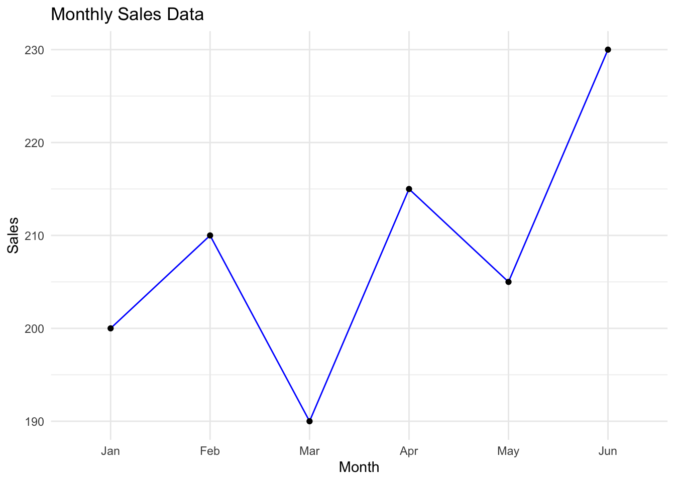
library(ggplot2)# Create a data frame with monthly sales datadata<-data.frame( Month =factor(c('Jan', 'Feb', 'Mar', 'Apr', 'May', 'Jun'), levels =c('Jan', 'Feb', 'Mar', 'Apr', 'May', 'Jun')), Sales =c(200, 210, 190, 215, 205, 230))# Plotting the line graphggplot(data, aes(x=Month, y=Sales))+geom_line(group=1, colour="blue")+geom_point()+labs(title="Monthly Sales Data", x="Month", y="Sales")+theme_minimal()
45.1.2 Example in Python
Let’s create a line plot using Python’s matplotlib and pandas libraries to visualize a simple trend of monthly sales data.
First, ensure you have the necessary packages installed:
pip install matplotlib pandas
Now, here’s how you can create a line plot:
Code
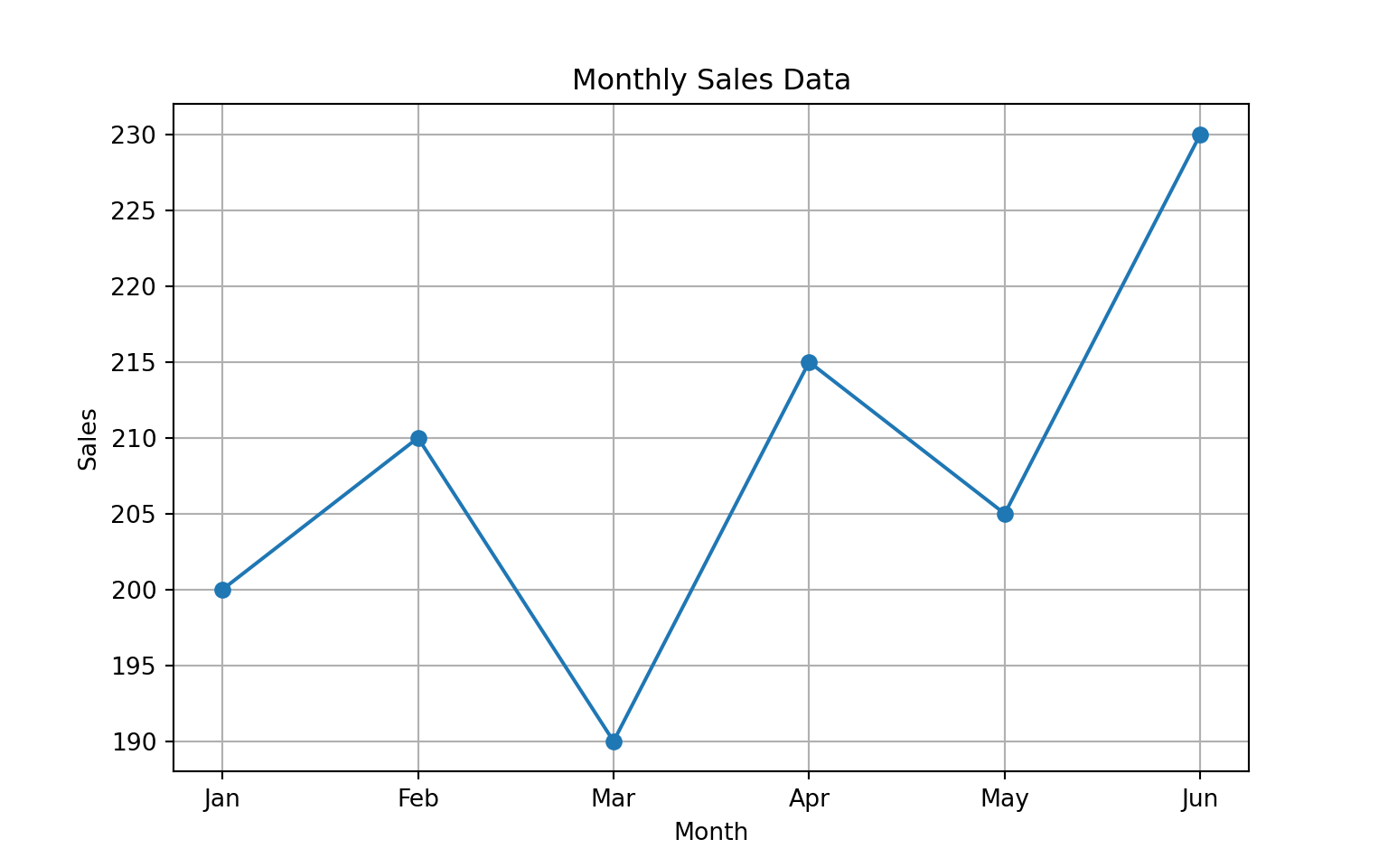
import pandas as pdimport matplotlib.pyplot as plt# Create a DataFrame with monthly sales datadata = {'Month': ['Jan', 'Feb', 'Mar', 'Apr', 'May', 'Jun'],'Sales': [200, 210, 190, 215, 205, 230]}df = pd.DataFrame(data)# Plotting the line graphplt.figure(figsize=(8, 5))plt.plot(df['Month'], df['Sales'], marker='o')plt.title('Monthly Sales Data')plt.xlabel('Month')plt.ylabel('Sales')plt.grid(True)plt.show()
In both examples, the line plot helps visualize how sales change month-over-month. Adjustments and additional analytical techniques can be applied to these plots for more detailed exploration, such as adding trend lines, plotting multiple categories, or analyzing seasonal effects. Line plots serve as a basic yet powerful tool for initial analyses, trend spotting, and decision-making support in data analysis.