Code
Pie charts are popular tools in data visualization for showing proportions and percentages among categories. They represent data in a circular format, where each slice of the pie corresponds to a category, and the size of each slice is proportional to its share of the total.
A 2D pie chart is a straightforward way to visualize data where each slice represents a portion of the whole. These charts are widely used in business and media to represent simple proportional data.
When presenting data visually, the choice between a 2D and a 3D pie chart can significantly affect how the information is perceived and understood by the audience. Each has its own advantages and limitations in terms of visual effectiveness and clarity. Here’s a comparison of the visual effectiveness of 2D versus 3D pie charts:
Advantages:
Limitations:
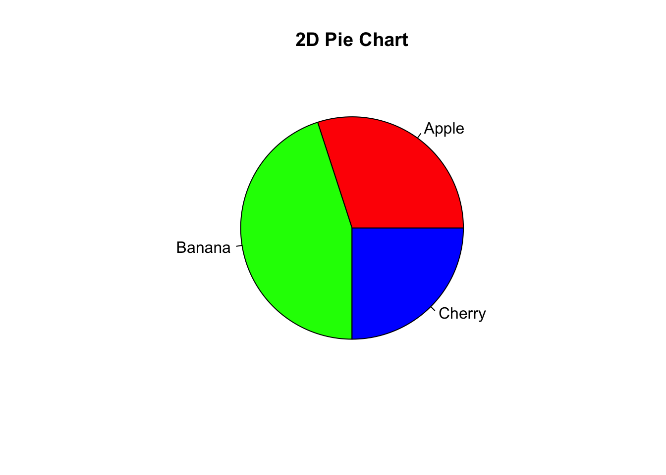
import matplotlib.pyplot as plt

# Data
categories = ["Apple", "Banana", "Cherry"]
values = [300, 450, 250]

# 2D Pie Chart
plt.pie(values, labels=categories, colors=plt.cm.Paired.colors[:len(values)], autopct='%1.1f%%')
([<matplotlib.patches.Wedge object at 0x14eb337d0>, <matplotlib.patches.Wedge object at 0x14eb15c70>, <matplotlib.patches.Wedge object at 0x14eb70380>], [Text(0.6465637441936395, 0.8899187180267095, 'Apple'), Text(-1.086457168210212, -0.17207795223283867, 'Banana'), Text(0.7778174593052022, -0.7778174593052025, 'Cherry')], [Text(0.3526711331965306, 0.48541020983275057, '30.0%'), Text(-0.5926130008419338, -0.09386070121791198, '45.0%'), Text(0.4242640687119284, -0.4242640687119286, '25.0%')])plt.title("2D Pie Chart")
plt.show()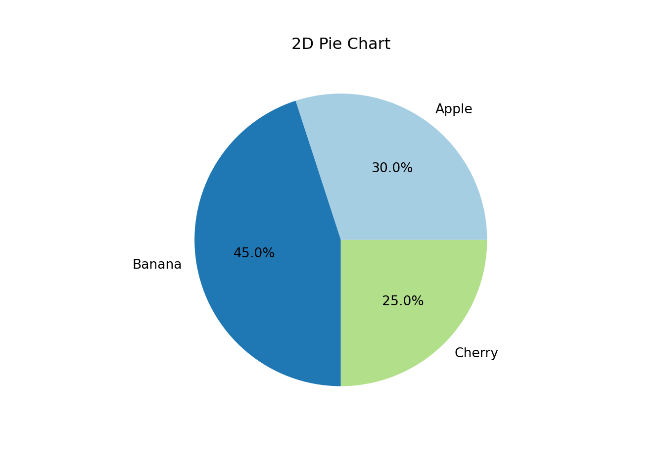
In both the R and Python code snippets, the data is first defined by specifying categories and their corresponding values. The pie() function in R and the plt.pie() function in Python then create the pie chart, with optional arguments for colors and labels.
A 3D pie chart adds a depth dimension to the traditional pie chart, creating a more visually striking representation. However, it is important to note that 3D pie charts can sometimes distort perception of the data, making some pieces appear larger or smaller than they actually are.
Advantages:
Visual Impact: 3D pie charts can be more visually engaging and attractive. The added dimension can make a chart stand out in a presentation, potentially keeping the audience more engaged.
Modern Look: They often look more “modern” and can be more appealing in contexts where the aesthetic design is important alongside the data being presented.
Limitations:
Distortion of Data: The 3D perspective can distort the perception of the size of each pie slice. This makes it difficult for viewers to compare the proportions accurately, as the farther slices can appear smaller than those closer to the viewer.
Overcomplication: The additional dimension can add unnecessary complexity to the data presentation, potentially leading to confusion rather than clarity.
Readability: Labels and text can be more challenging to place and read in 3D pie charts, which can lead to overcrowding or overlapping of elements, further complicating the interpretation.
In R, creating a 3D pie chart is not supported directly in the base installation, but packages like plotly can be used for an interactive 3D pie chart.
# If necessary, install plotly: install.packages("plotly")
library(plotly)

# Data
categories <- c("Apple", "Banana", "Cherry")
values <- c(300, 450, 250)

# 3D Pie Chart using plotly
fig <- plot_ly(labels = categories, values = values, type = 'pie', textinfo = 'label+percent',
               insidetextorientation = 'radial', marker = list(colors = c('#FF9999', '#66B3FF', '#99FF99')))
fig <- fig %>% layout(title = "3D Pie Chart", showlegend = TRUE)
figPython’s matplotlib library does not support 3D pie charts, but you can use plotly.express as well for an interactive version.
import plotly.express as px

# Data
categories = ["Apple", "Banana", "Cherry"]
values = [300, 450, 250]

# 3D Pie Chart using plotly express
fig = px.pie(names=categories, values=values, title='3D Pie Chart')
fig.update_traces(textinfo='percent+label', insidetextorientation='radial')fig.show()For both 2D and 3D pie charts, the tools and libraries available in R and Python make it easy to create visualizations that are both informative and aesthetically pleasing. However, it’s good practice to choose the type of chart that accurately reflects the data without adding unnecessary complexity or potential for misinterpretation.
Data Accuracy and Comparison Needs: If the primary goal is to communicate precise data or make comparisons between categories, 2D pie charts are generally more effective. They provide a straightforward, undistorted presentation of data.
Audience Engagement and Contextual Use: If the goal is to make a visual impact in a less formal setting or to catch the viewer’s eye in marketing materials or part of a less data-intensive presentation, a 3D pie chart might be more appropriate.
While 3D pie charts can be more engaging due to their aesthetic appeal, 2D pie charts are typically more effective for accurate data representation and ease of understanding. The choice between using a 2D or 3D pie chart should depend on the specific context of the presentation, the nature of the data, and the audience’s needs.
Generally, for business and scientific presentations where clarity and precision are paramount, 2D pie charts are preferable. For advertising or promotional materials where visual impact plays a more significant role, 3D pie charts might be considered.